Case Study
Energy Loss Analysis & Optimization
Turning a manual, spreadsheet-driven calculation into a granular, trustworthy dashboard — and a reason to choose Solargik hardware in the first place.
AnalyticsData VisualizationDashboard UXB2B SaaS
The Opportunity
Loss analysis is critical to maximizing production on PV (solar) projects, but most of the industry's monitoring platforms don't do it well. The major SCADAs on the market offer some version of it, without the precision teams actually need — so the EPCs and O&Ms who build and maintain these sites end up doing it manually: an analyst runs expected-vs-actual production against the customer's own performance-ratio formula, while the field team tries to trace losses back to historic alerts and tickets.
We saw a chance to build something genuinely better — precise enough to become a real tie-breaker in sales conversations, not just another checkbox feature. It would give prospective customers a concrete reason Solargik trackers outperform, and a reason to pay for the software layer on top. We were well positioned to deliver it: our sensors and trackers in the field, plus direct connections to inverters, gave us granular data to build on, rather than reconstructing it secondhand through a cloud API.
My Role
Product Designer, owning UX strategy and interaction design end to end — from mapping the existing manual workflow through to the shipped v1 and the v2 improvements driven by customer validation.
The Process
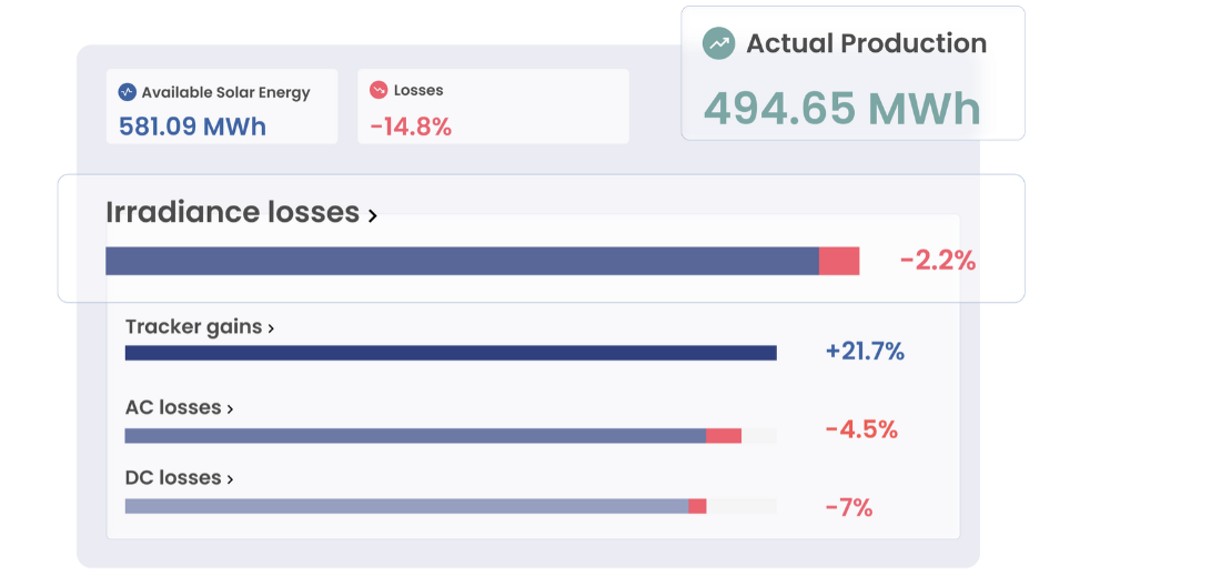
The core goal was to create a clear, intuitive view for site operators to analyze energy loss sources and track actual versus expected production.
- Discovery: deeply mapping the existing manual loss-analysis workflow used by O&M teams.
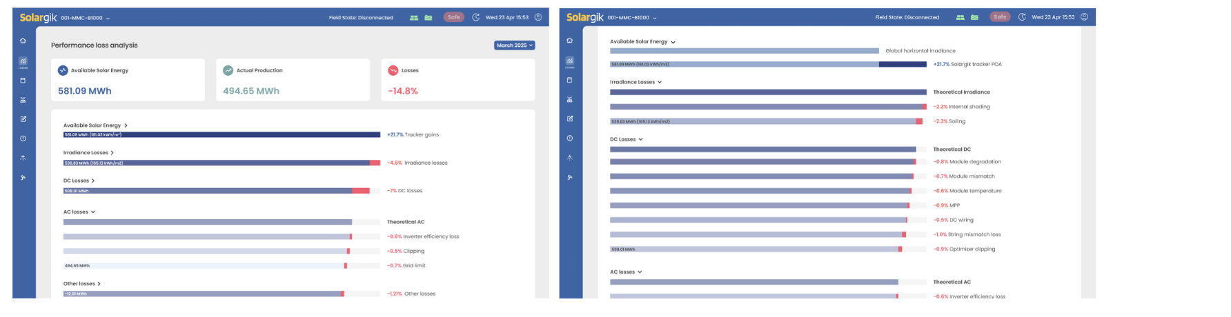
- Design & Visualization: the central design challenge was creating a clean, high-fidelity visual representation of the gap between planned energy production and actual output. We focused on delivering a "glanceable" summary that provided immediate, clear value even before the user interacted further. This meant translating complex, interdependent parameters — environmental, equipment, contractual — into a structured loss breakdown, letting users drill into every subcategory. A key priority was data credibility: giving operators confidence that the numbers accurately reflected the performance shortfall.
- Validation: deploying the initial design and running in-depth interviews off the back of enthusiastic customer feedback. That feedback directly inspired and shaped the drill-down improvements in the v2 release below.
Key UX Decisions
Glanceable Summary
Available energy, actual production, and total loss surfaced before any interaction — value at a glance, drill-down optional.
Structured Drill-Down
Every loss category opens into its own subcategory breakdown instead of one flat list.
Data Credibility First
Theoretical baselines shown alongside real losses, so operators trust the numbers enough to act on them.
Validated, Not Assumed
The v2 drill-down came directly from customer interviews, not internal guesses about what operators needed.
The Outcome
The project turned complex data into clear, actionable insight, empowering operators to troubleshoot faster and with confidence.
- User success: operators adopted the tool rapidly. The design delivered immediate value through a single-glance dashboard summary, paired with the ability to drill down and understand the precise losses in every subcategory — customer feedback confirmed how valuable that dual functionality became in their daily work, significantly reducing time spent on manual analysis.
- Business impact: the new design was highlighted in company keynotes and industry conferences as a leading feature of the monitoring platform, directly contributing to product adoption and sales.
Granular loss visibility
Faster troubleshooting
Sales differentiator
Rapid adoption